JIM Search

Just Isn’t Music wanted to design and build a “search engine” that would help visitors discover the huge variety of music on their roster and simplify the process of making an enquiry.
Early-on in the design process we decided that search wasn’t the best mechanism to encourage discovery of the music on the platform. A user typically comes to a search engine knowing exactly what they want to find, but for our application a big empty white text box would would actually be a barrier to discovering new music. An interface that allowed exploration – one that helps the user to identify their specific requirements and make suggestions – would ultimately yield better results for the user and the company.

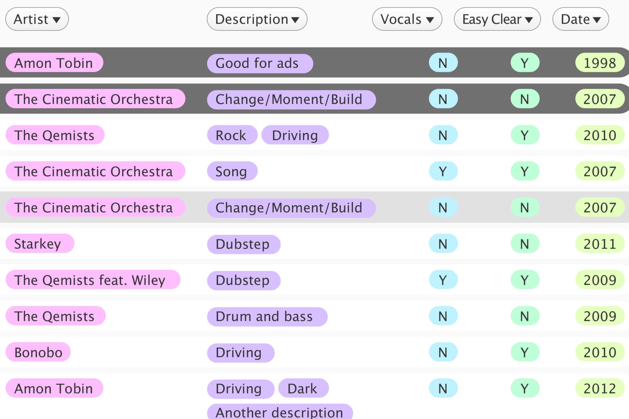
Their existing system (shown above) although rudimentary, proved to be a useful insight into how they sort and categorise the tracks internally. Essentially it’s a folder structure with labels that describe the music files inside – using genre, style, and mood as the primary descriptors.
This category-based system was limiting however because of the eclectic nature of music – what folder would a quirky chill-out track be placed in? We decided that tags rather than categories would allow more freedom to describe the music, and this new approach helped us realise that a filter-based search mechanism would be ideal for the application.


The dominating feature of the final user interface is the circular music player used to preview tracks.
