Paperchase
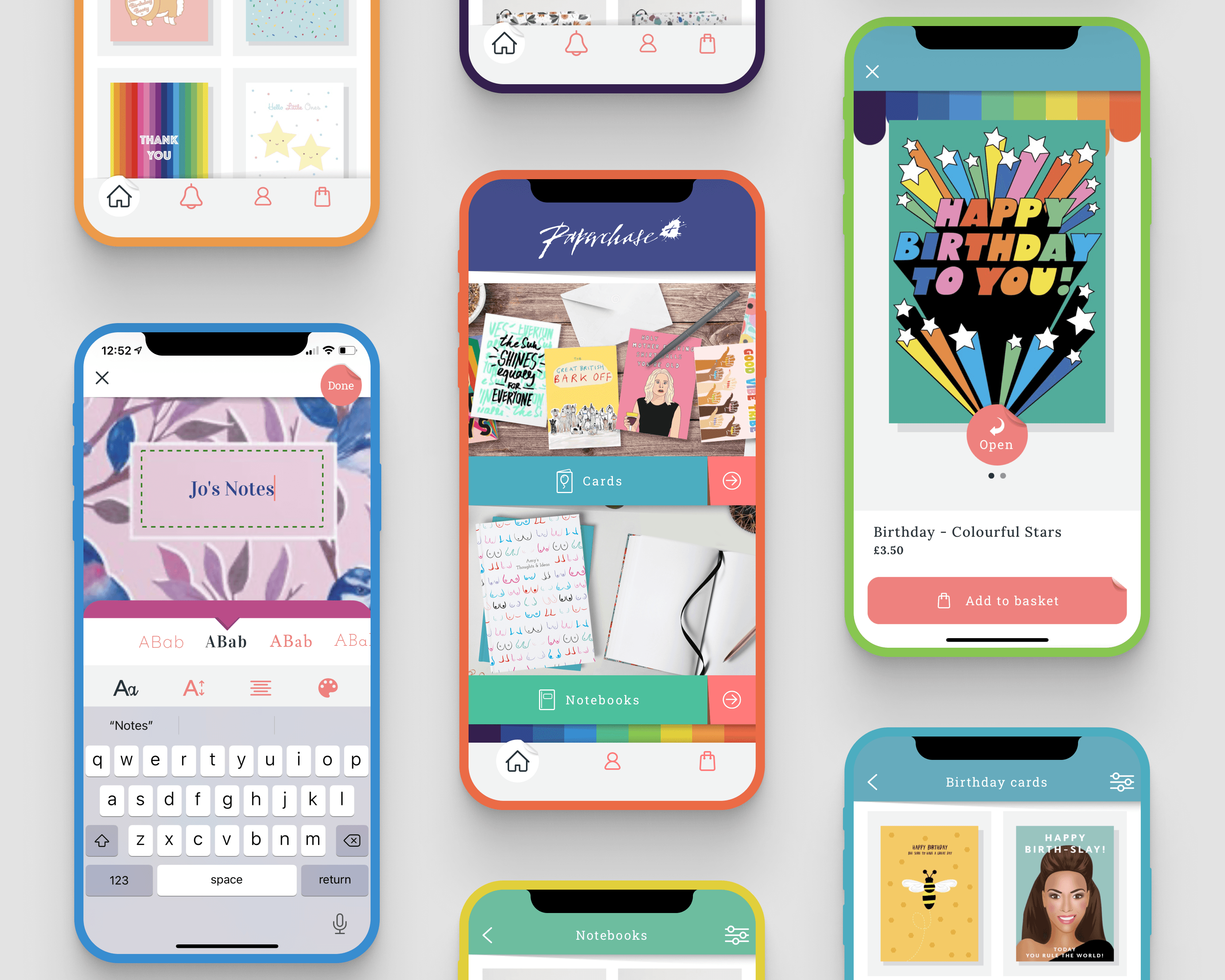
The Paperchase Plus app enables customers to buy premium personalised products from Paperchase.
I was asked to join a small team of product specialists to create the app from scratch, leading the design effort from a user experience perspective. Our mission was to go from concept to v1.0 in the midst of a global pandemic with local lockdowns forcing the entire team to work remotely from their kitchens and spare bedrooms.
Ultimately we wanted to create a digital product that embodied the quality and feel-good factor of Paperchase products that customers already know and love.
How we did it
Development began back in December 2019 when we started researching the various products already on the market, which included the likes of Moonpig, Papier, Touchnote, and Thortful. By studying and assessing the customer journeys for each of these existing products we were able to identify clear areas for improvement - such as the onboarding experience and how customers personalise their products.
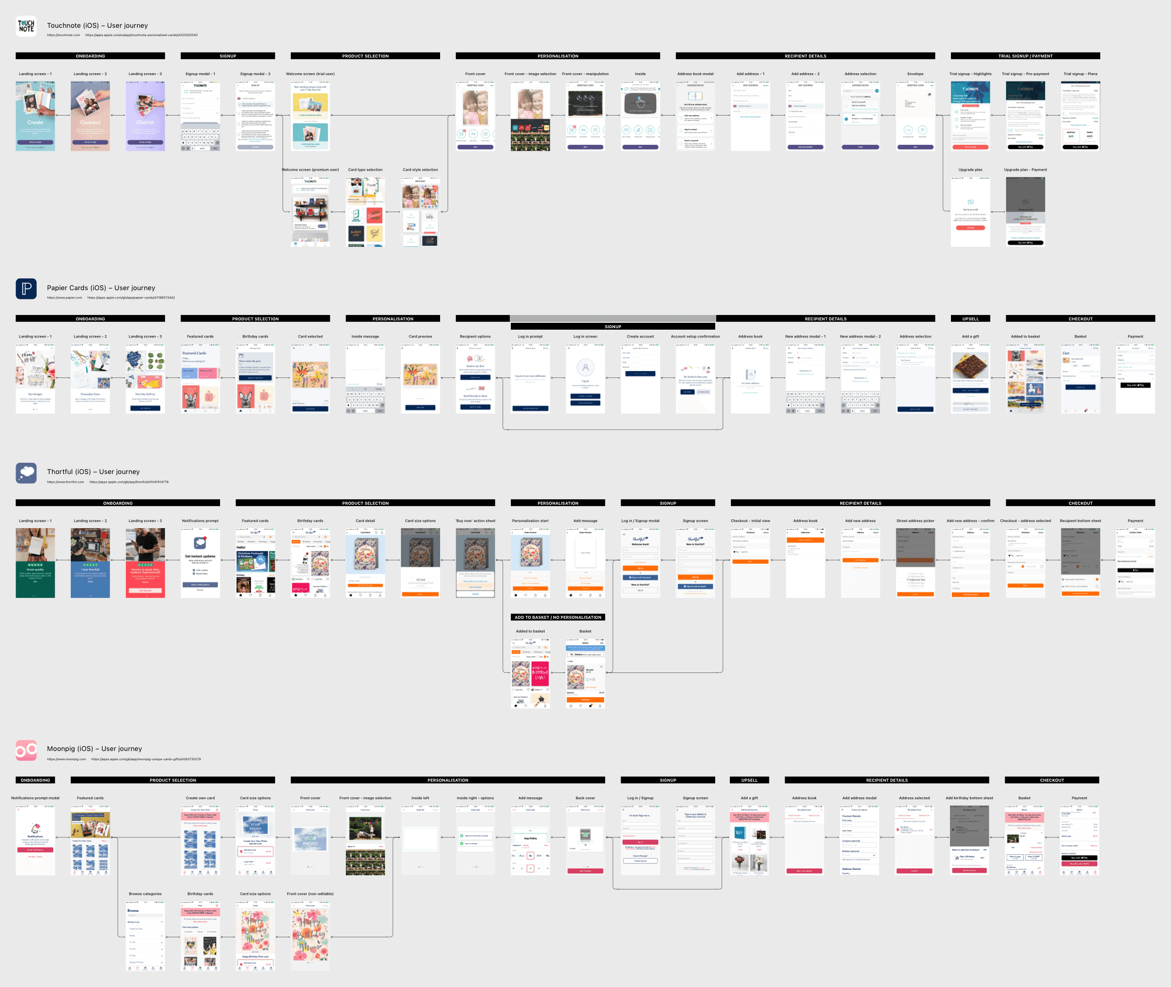
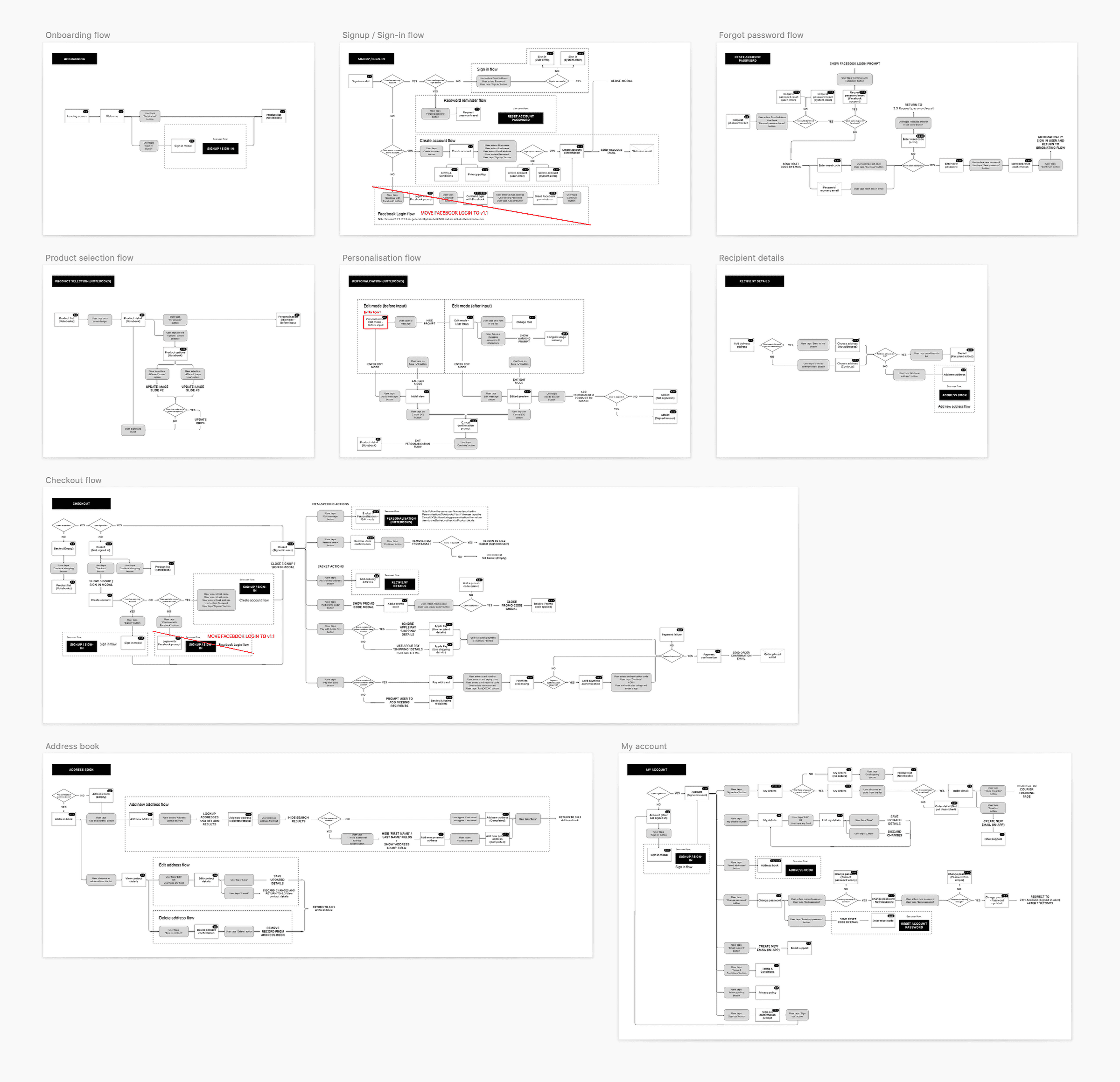
The competitor research phase was essential because it gave us a solid framework for what our customer journey should look like, at the same time highlighting the pitfalls we should avoid. With the basic customer journey mapped out, we were able to start defining the user flows and wireframes for each step, some of which you can see below.
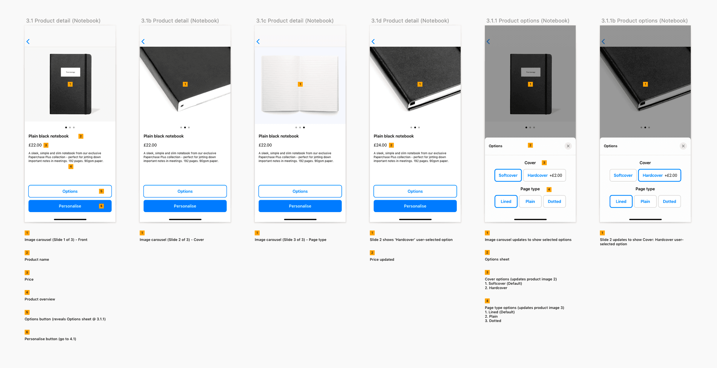
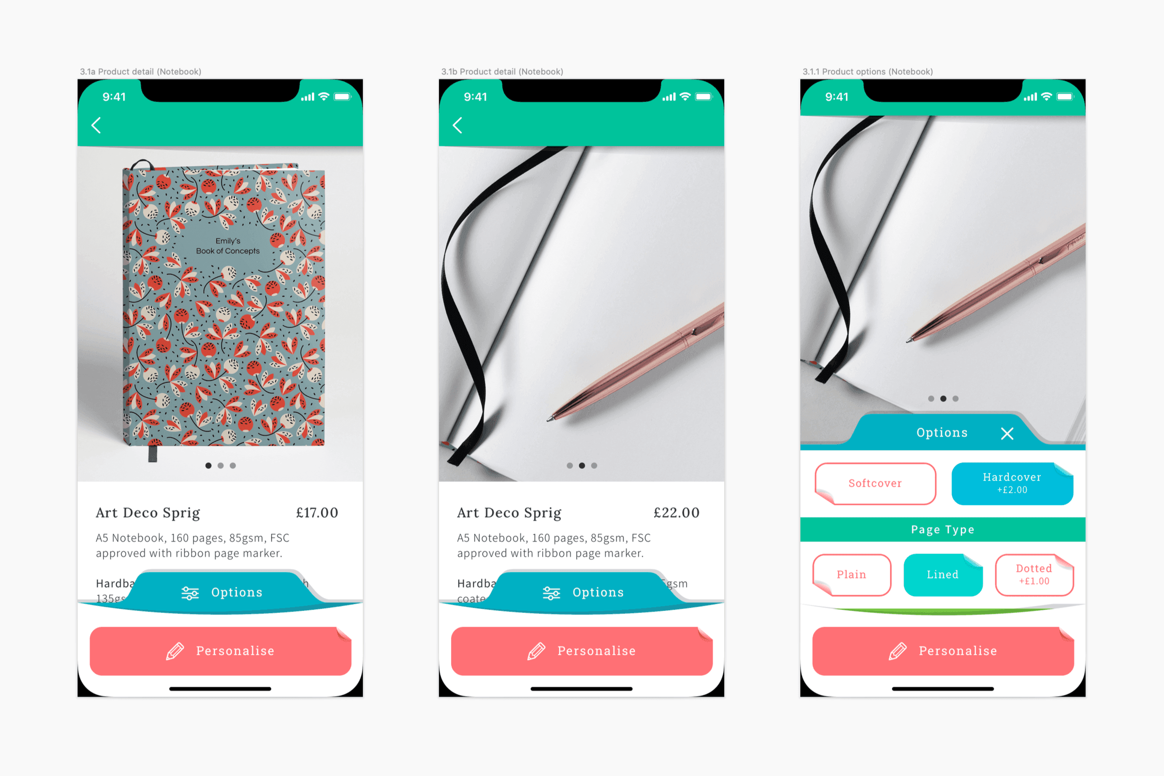
While the design team were busy crafting the visual elements, the developers began laying the foundations for the backend and core front-end functionality, as well as liaising with the print production team to ensure integration with the printer’s systems. Over the course of 5 months and 10,000 hours on Zoom calls (well, maybe not that many) we designed, tested, redesigned, and tested again, until the first version of Paperchase Plus hit the App Store in August 2020.
Making it personal
One of my favourite parts of the app is the personalisation editor where customers can add a stylized message to their chosen notebook or greetings card. This was a challenging feature to design as it required a lot of joined-up thinking and collaboration across the team, from defining the interactivity of the tools (as well as understanding the limitations) to ensuring the final printed product matched what customers saw on the screen.
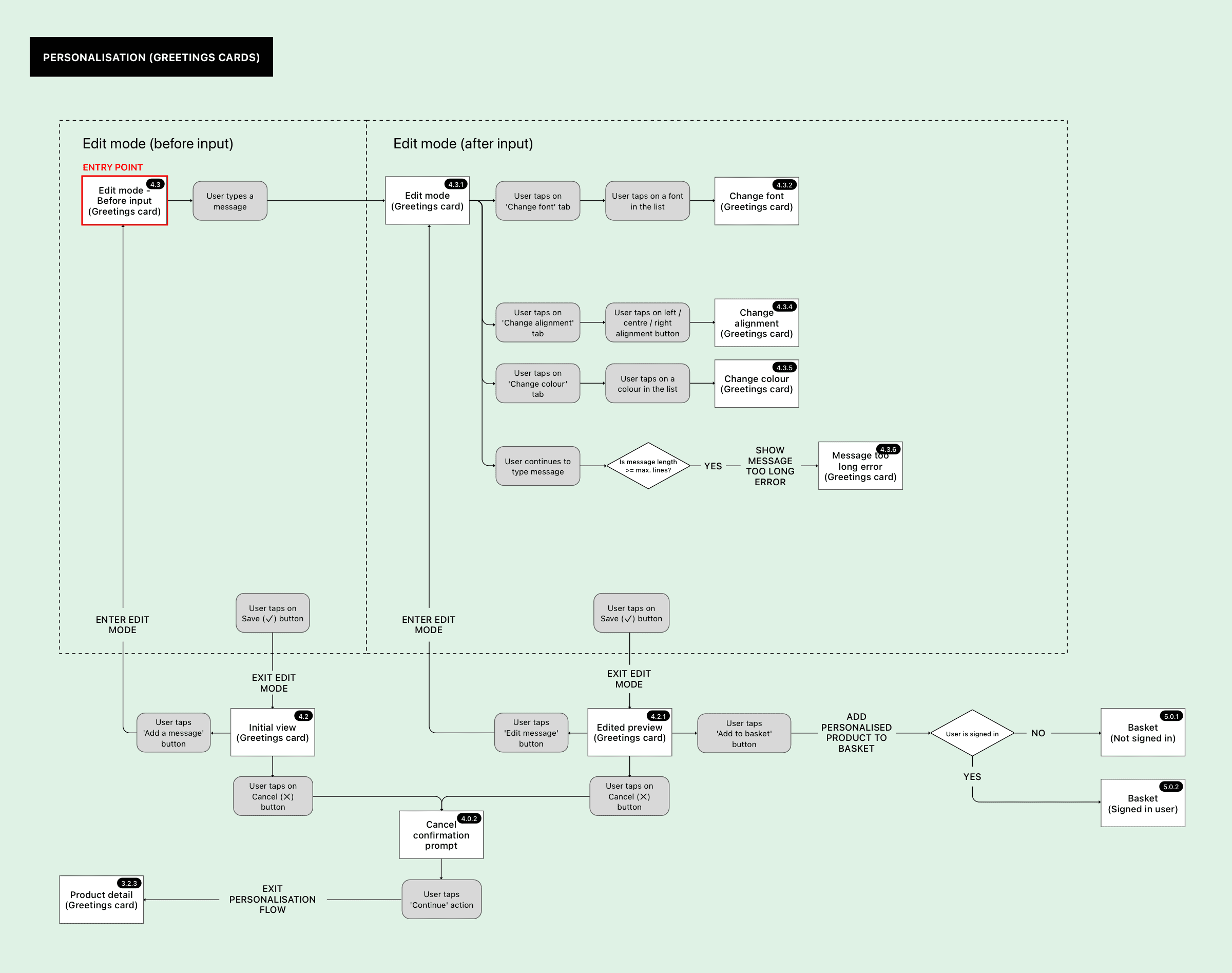
During the research phase, we identified what personalisation options would be desirable (i.e. offer the most value to customers) whilst being viable (time constraints) and technically feasible from a print/production basis. We focussed on three options for the launch version: font, colour, and alignment. The user flow for the personalisation editor ended up looking something like this:
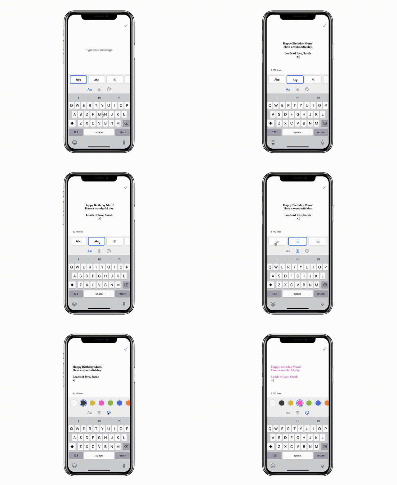
Throughout the design process, we used simple prototypes to test all new features (the personalisation editor prototype is shown below). This helped us identify any usability issues before proceeding with engineering.
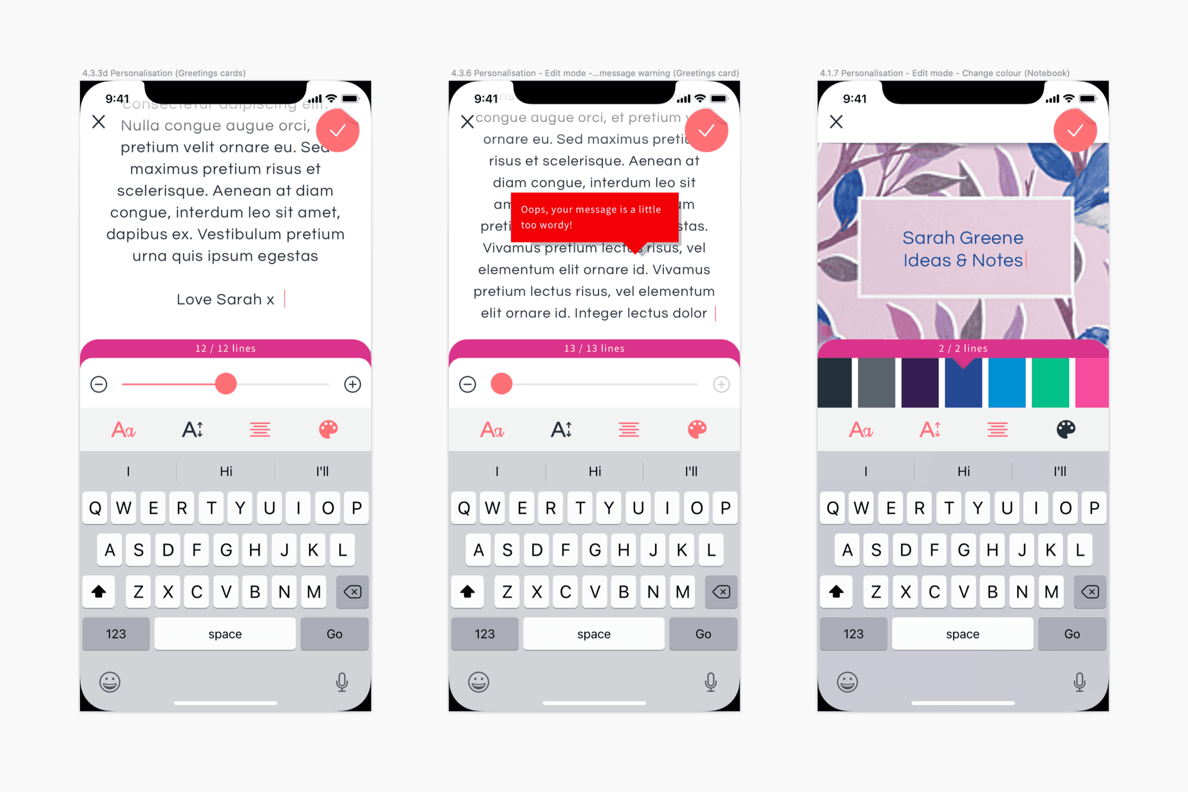
Close collaboration with the front-end developers helped us design features that were difficult to prototype. One example of this was the need to handle excessively long or unusually formatted messages in a way that didn’t restrict the customer’s freedom to express themselves creatively. This was eventually solved by the introduction of a line counter, dynamically resizing text, and prompts to explain when there’s a problem with the message. We also introduced custom palettes for each notebook to help users choose background/foreground colour combinations that always look good when printed.
Credits
- Design
- Ben Stevens, Steve Simmonds, Alix Craig, Rona Marin Miller
- Engineering
Biljana Lukic, Momir Kostic, Nemanja Modic, Miroslav Boljanovic, Nemanja Vujovic, Dragan Nedeljkov, Spasoje Jesic
- Product
- Derek Kenneally, Valeria Del Sordo, Kristina Ostojic, Joe Timson
- Print production
- Steve Palmer